Book Design


—SAP Visiting Scholars
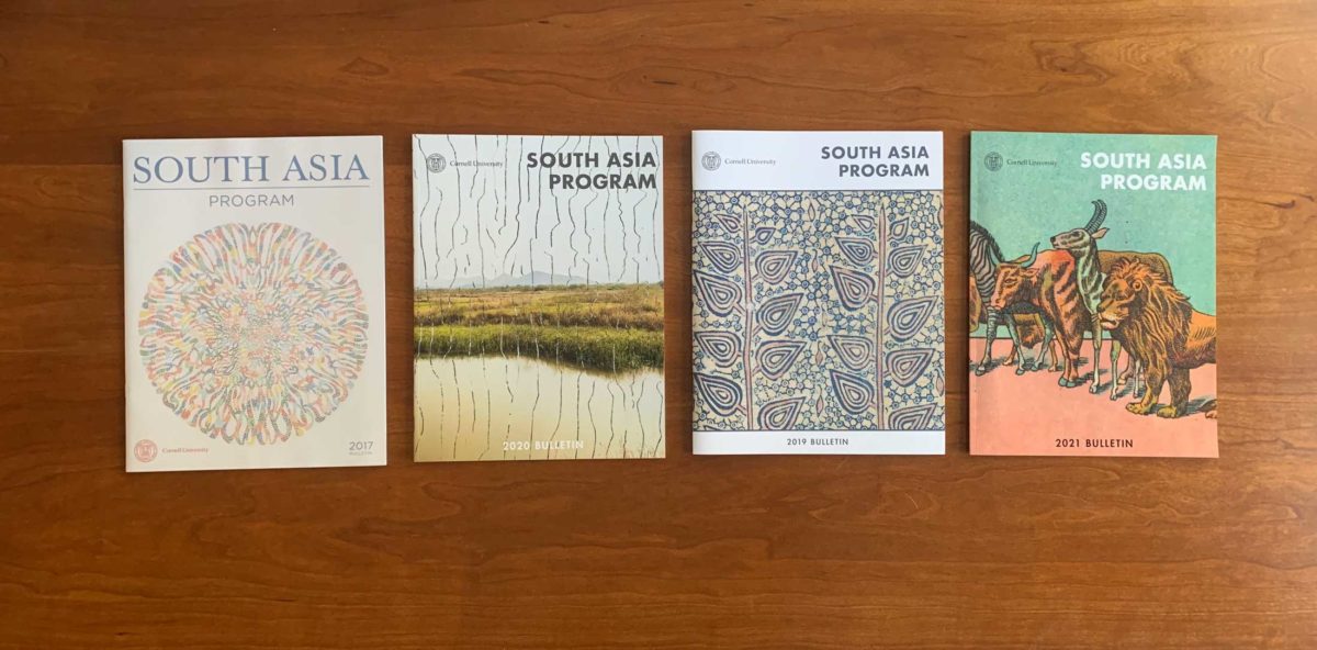
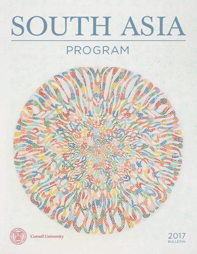
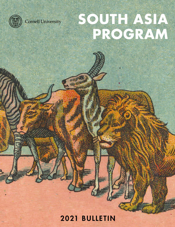
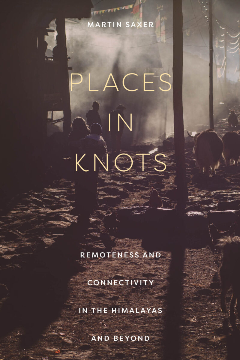
University Publications: South Asia Program of Cornell University Selected Covers Designs by Scarlet Duba
In November 2014, I gave a talk at the Type Directors Club to the Marywood University MFA Design/Illustration students. I was so excited to be introduced as (and representing!!!) a Woman in the Graphic Design field! It was so great to share my work and my unique story to an inspiring crowd of designers and illustrators. — at Type Directors Club.
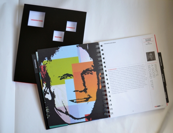
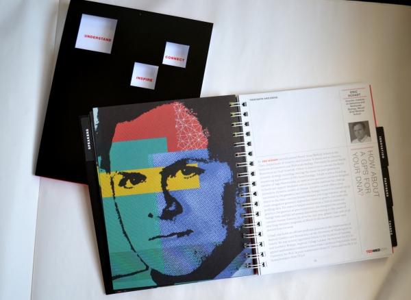
I’ve been traveling to Alexander Isley‘s studio in Connecticut, to work on the TED MED conference program. We designed 50+ unique portraits for each speaker. The design process was very experimental. I photographed black and white portraits on the tv/computer screen to get the moiré pattern effect. Typically this is something photographers try to avoid. But, it allowed each one to be a unique, and the effect added depth and texture to the flat black art. I then added color overlays behind the black and spotted them with white line art for more texture. Portraits recognized in the CADC Excellence Award as the portrait Illustrator for TED MED 2011.


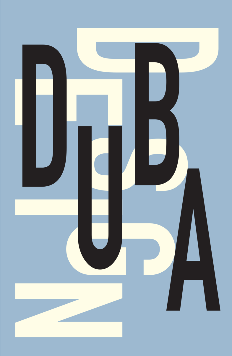
When I was about 10+ years old I would draw block letters and enjoyed making posters for school and sport events. The block type was whimsical and often in as many colors and patterns in the counters as possible. When I would deconstruct what I normally saw as a word or a single letterform new meanings and new shapes presented themselves. This gave way to a form of personal expression for me and one that developed into my design career today. It is in the unexpected resolution of a word or fun play with basic graphic forms that stimulates a designer’s mind.
When I recently saw Paul Rand’s DADA DADA poster again, I had to do a double take on the letters because I thought I saw my last name DUBA! My mind had jumped on the connection of those 4 similar letters and planted the poster idea (see below>>). My 10 year old self helped unearth what it is that represents the business I call “Duba Design”. The crossover of art and design is in the process of making—and this has shaped me as a designer artist and not exclusively a graphic designer.
Paul Rand has always been an inspiration for me because of his free-style paired with communications. My mentor Woody Pirtle, AIGA medalist/Pentagram Emeritus, was also inspired by his work and inspired me the same. I’ll write more about early influences and how they inform a creative life and career.
What is? Dada was a cultural movement and also represented a break-away from traditional art aesthetics as well as meaning. When I think about the process of design Dadism is this. The process is about deconstructing what is, to discover something new. Whether be more beautiful, more functional and absolutely more communicative. Some artists, especially that work with found objects and collage have a similar process with breaking down meaning and sometimes tradition to reveal new ideas from the recycled to start dialogue about the world around us. The crossover of art and design is in the process of making — and this has shaped me as a designer artist and not exclusively a graphic designer. Dada was a movement that originated in Switzerland and spread across Europe and into the United States although it was considered an anti-movement in a way.
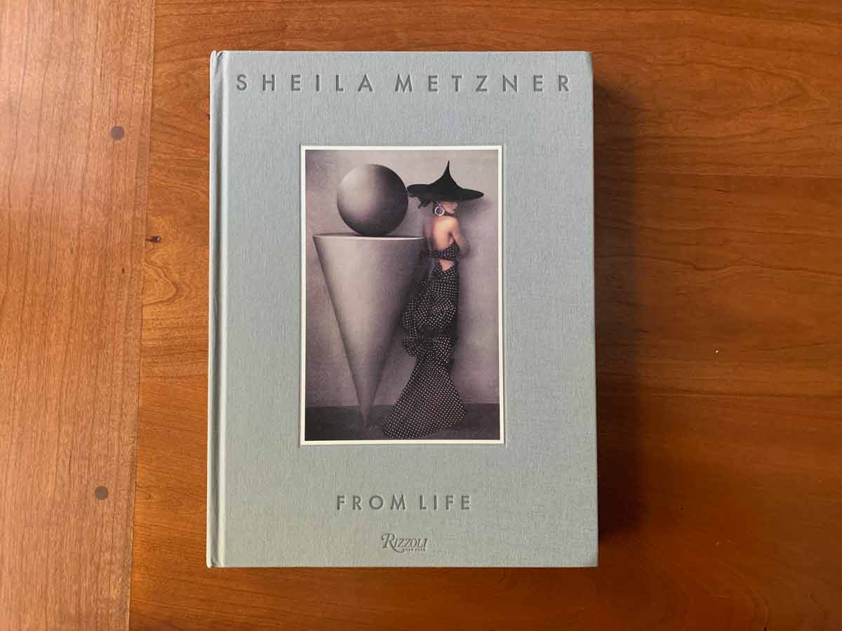
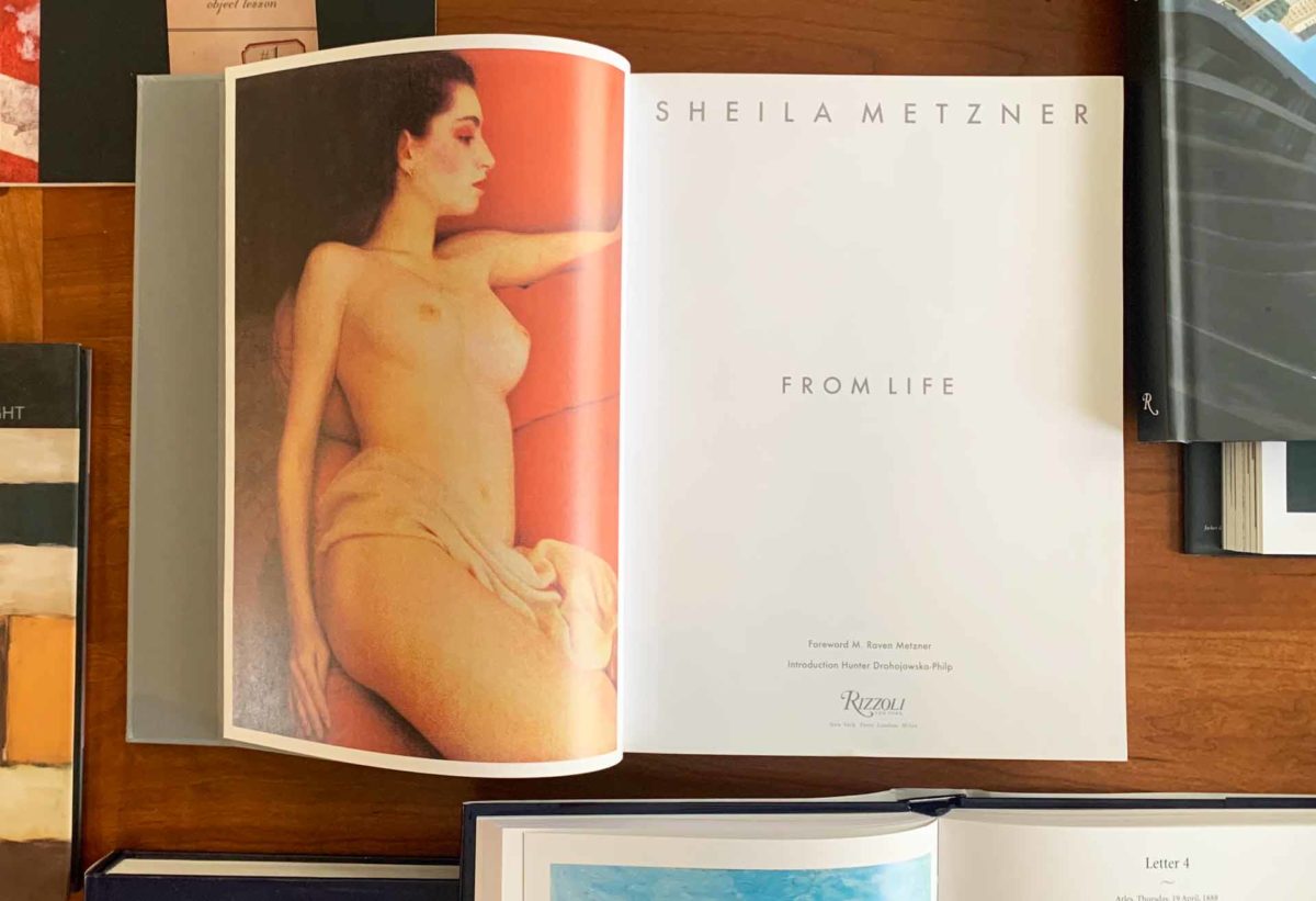
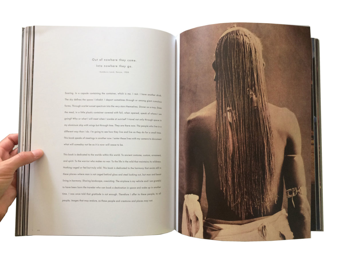
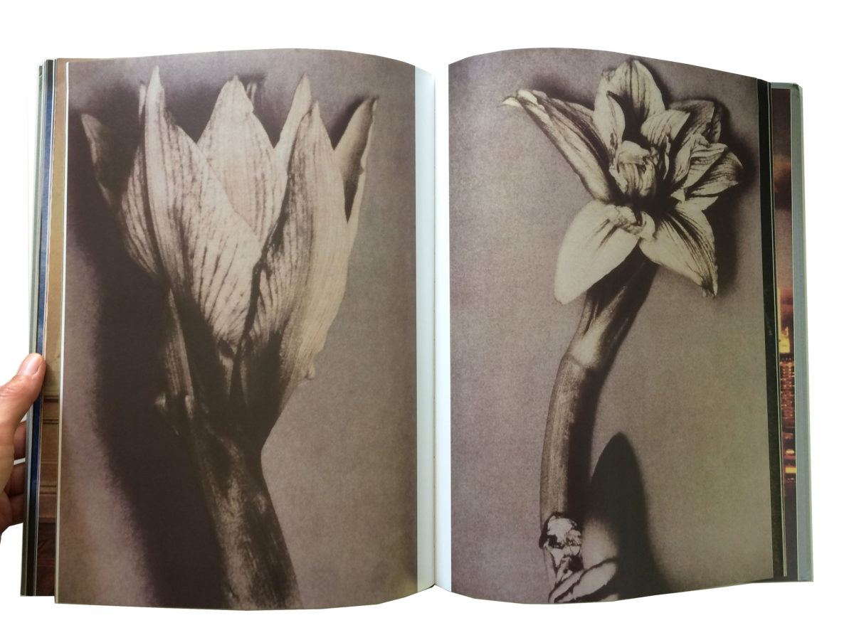 Design: Scarlet Duba, Woody Pirtle, Pirtle Design
Check out my other book designs >

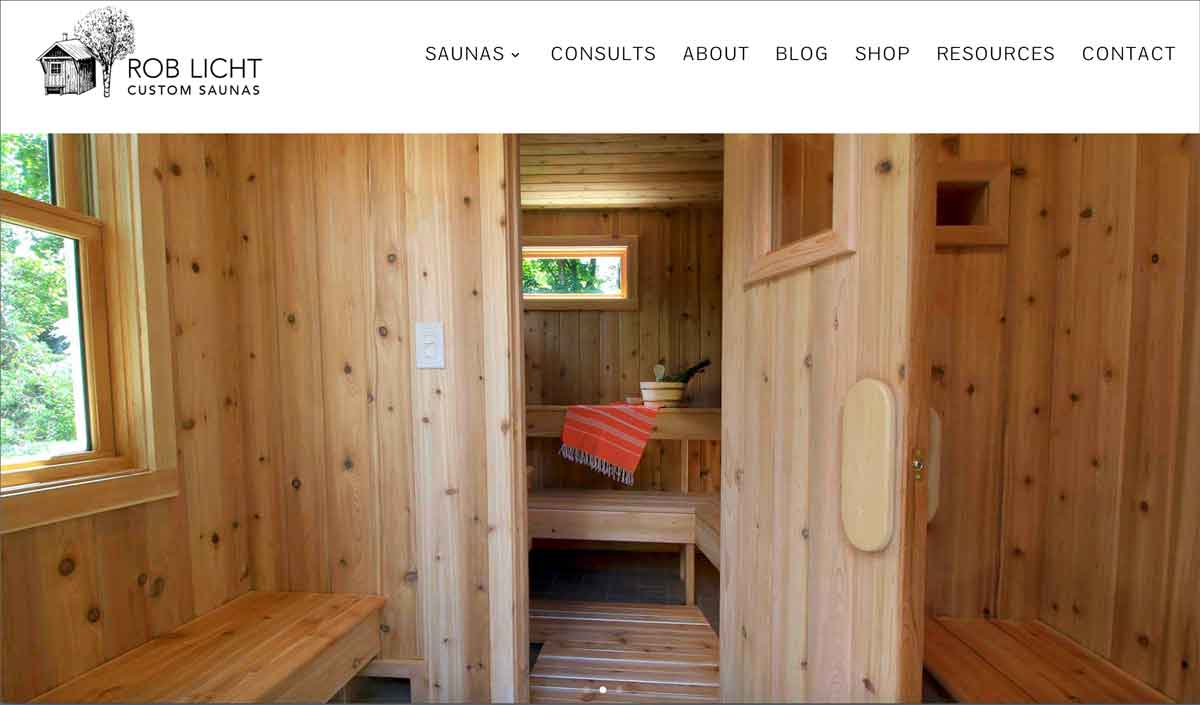
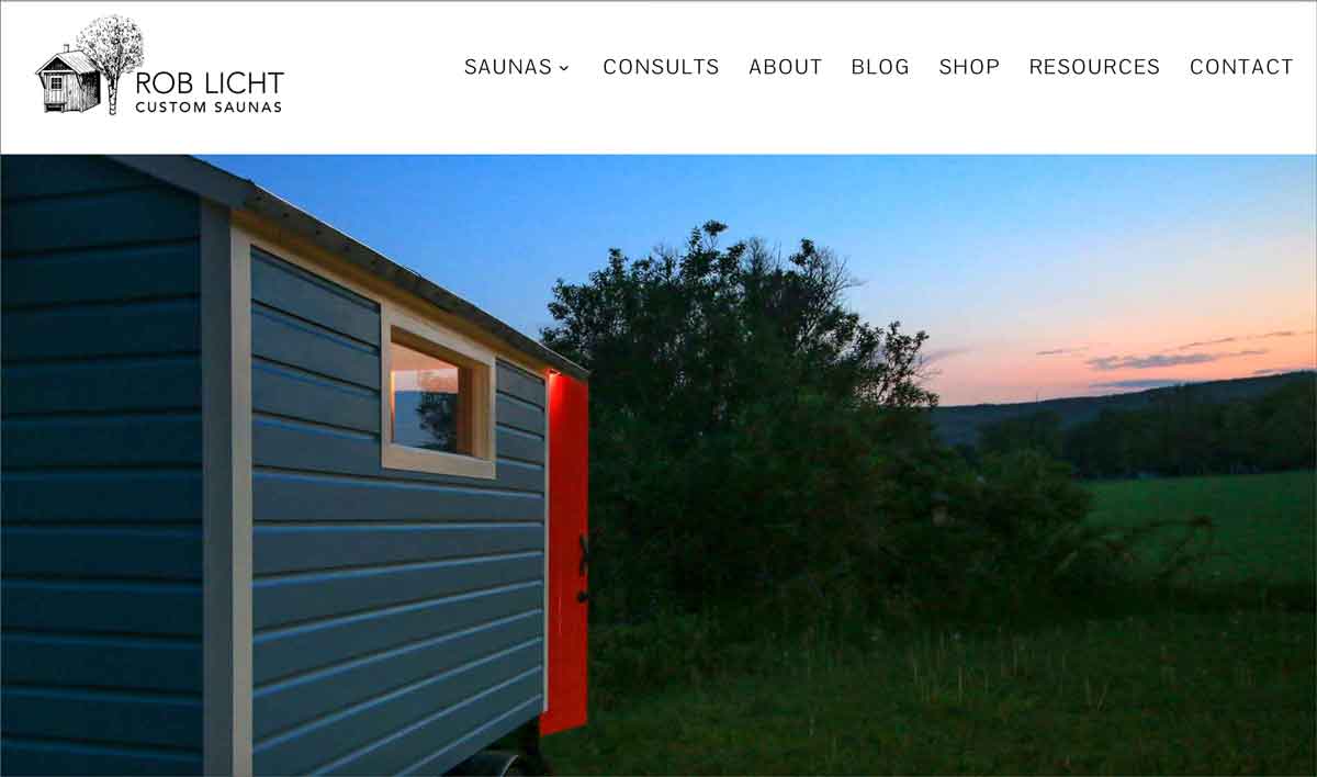
“Scarlet designed and developed the web page for my sauna business. Since it’s inception the web page has had close to 100,000 views and gotten me clients from all over the world. I always ask people how they found me and they always mention the web page as being well designed and easy to use. Scarlet’s clean aesthetic sense and clear understanding of web page design conveys a strong message about my own product design: clean design, clear communication, and an unfettered aesthetic. I highly recommend her.”
—Rob Licht, Custom Saunas
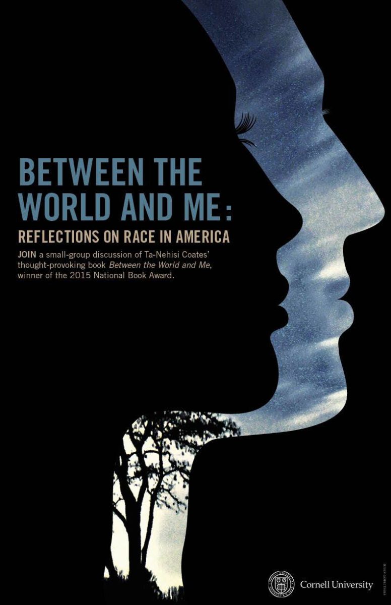

Top Left: Race in America: A Poster for Cornell University, Africana Studies; Poster for Cornell University, ICM
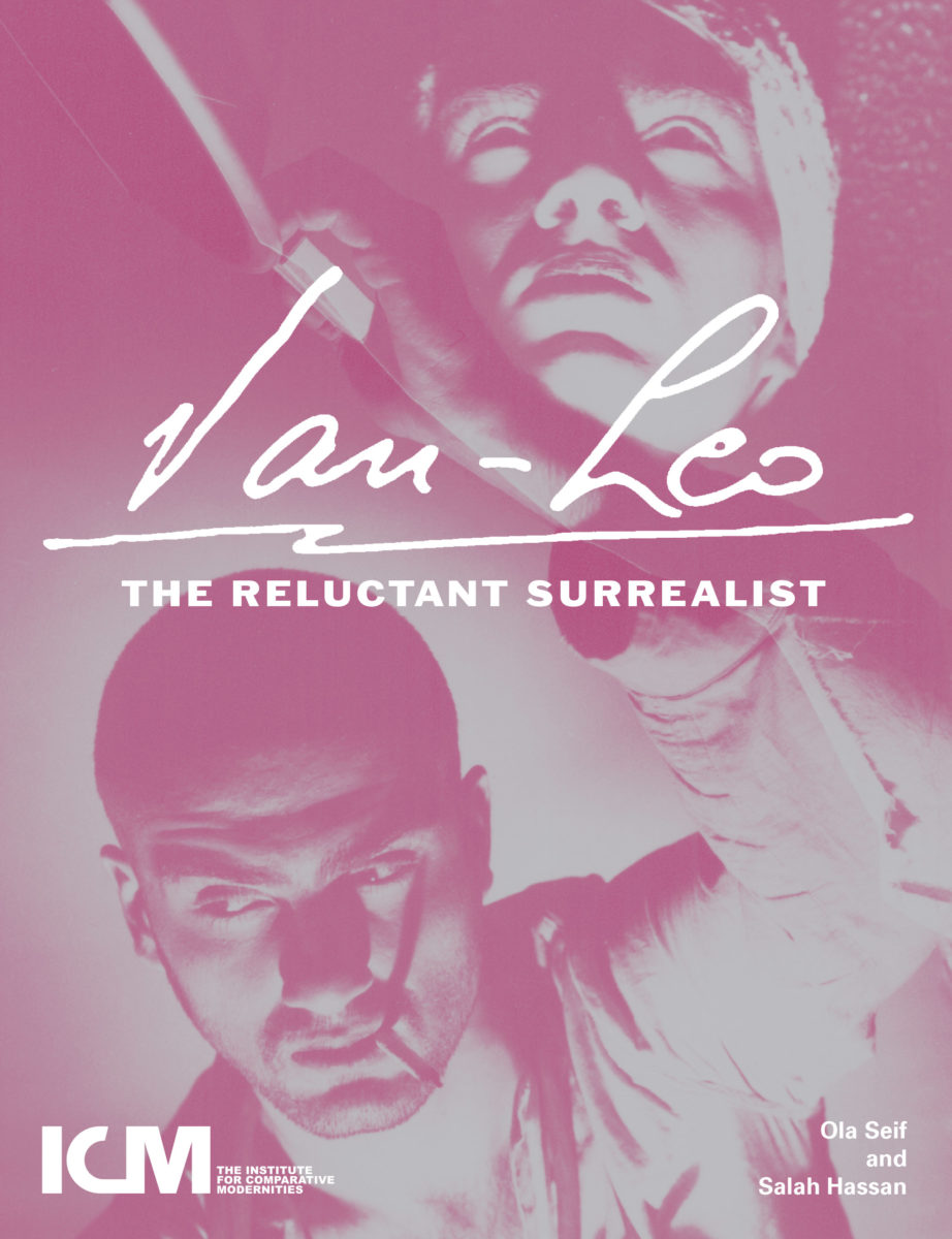
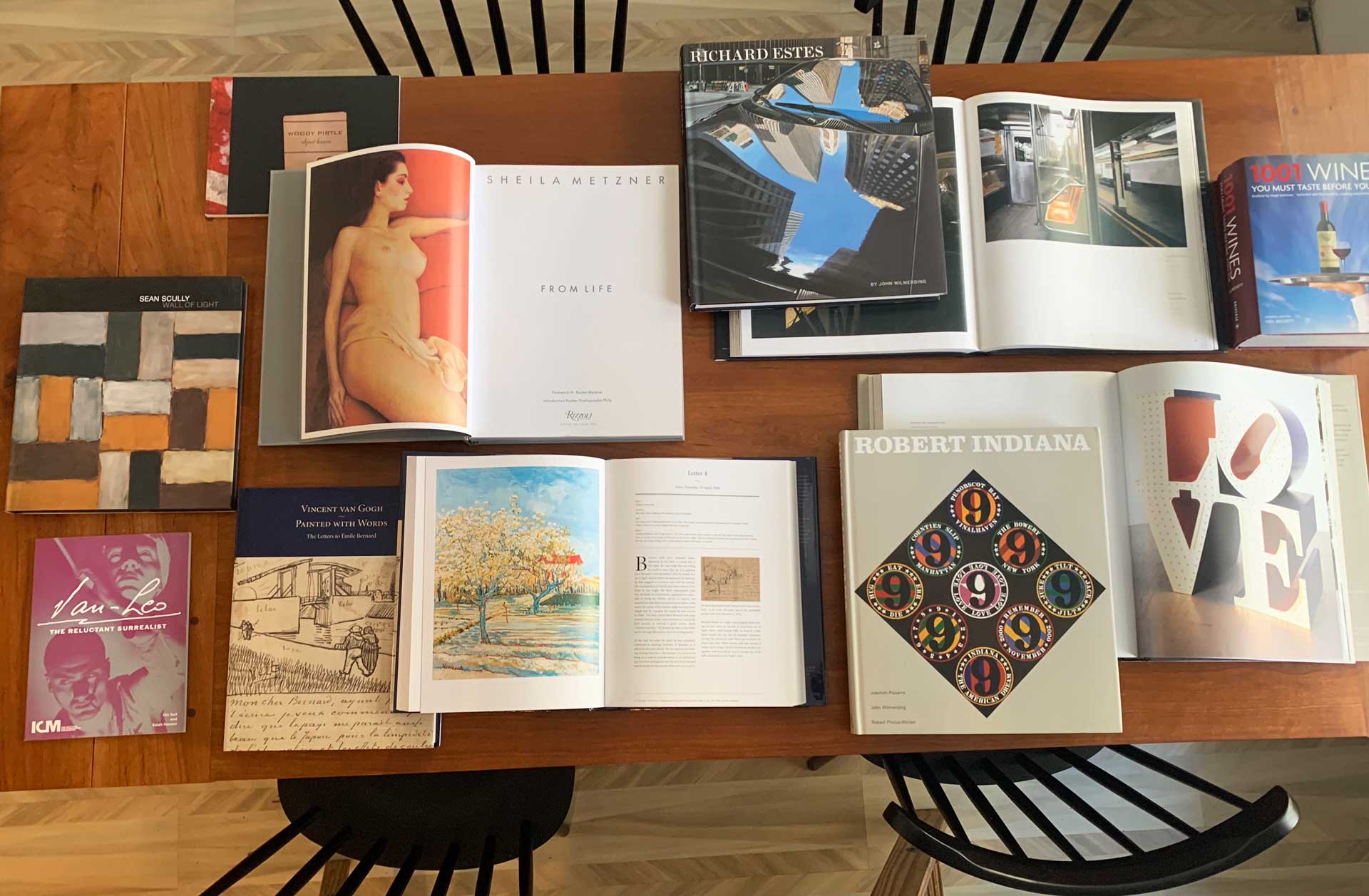
A Photographer‘s Exhibition Book for Cornell University Published by Africa World Press. Van-Leo: The Reluctant Surrealist (Cornell AAP) Within the book there are brilliant writings about the artist as well as a rare portfolio of the photographer’s self-portraiture from the 1940’s in Cairo, Egypt. Published by Africa World Press.
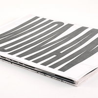
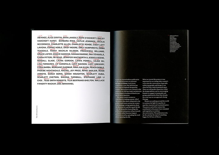
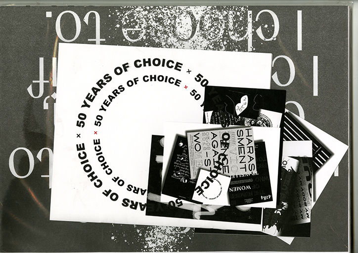
50 Years of Choice: A publication celebrating 50 years of abortion being legalized in England through 50 typographic posters designed by women. This publication will be launched on International Women’s day in March. All profits will go towards charities or organizations working to repeal the 8th. 50 Years of Choice is a publication containing 50 posters by 50 women. I feel honored to be one of them. Full Story here.
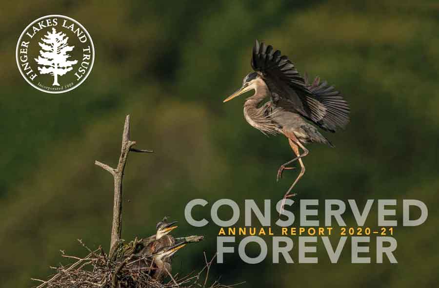

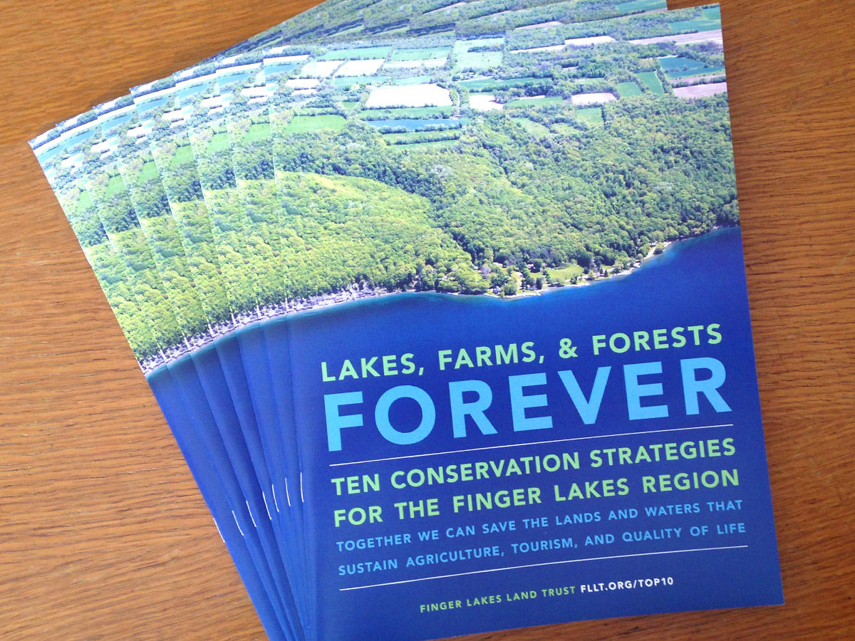
—Founding member, Finger Lakes Land Trust


Lakes, Farms, and Forests Forever, highlights strategies, by the Finger Lakes Land Trust, to counter threats (like toxic algae) and protect our region. Booklet Design and Annual Report by Scarlet Duba, Duba Design.


Pirtle Design, Woody Pirtle, Scarlet Duba
A poster design I recently did for a Design week at SUNY New Paltz. It is called “Be Kind To Your Creative Environment” and it is about what I think is an important part of process and creative work. Self-doubt, at any stage of process, stops creative flow and ultimately project completion. What does the creative process boil down to for you?
Poster Design by Scarlet Duba
A bit of press. Read the story .. I’m #9!
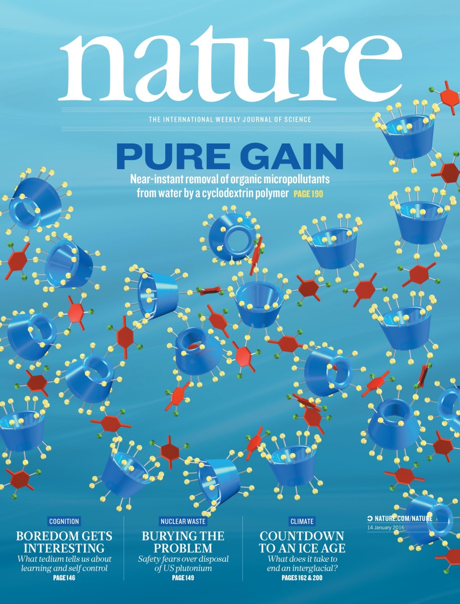
A great surprise today. The Nature Journal cover design, I had my hand in, has been selected! Volume 529 Number 7585 pp127-248 January 14th 2016. Read about the ground-breaking research done at Cornell University (and beyond…) by William Dichtel, Damian Helbling and colleagues. There “is an alternative to activated carbon for water remediation…. porous polymers … absorbing a range of pharmaceuticals, pesticides and other pollutants.” This is the work I live for!
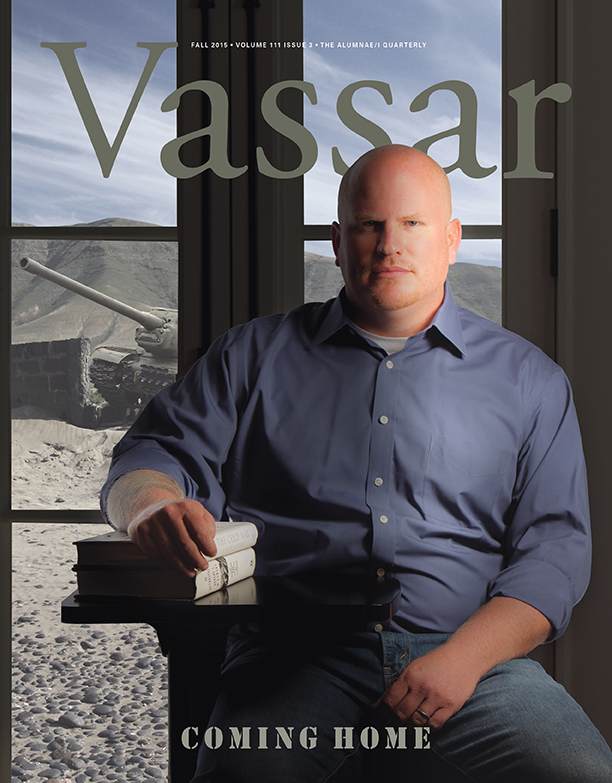
Veterans of war face a host of issues when they return home, but these members of the Vassar community are helping them adjust to civilian life and find solutions for PTSD. Cover Design concept: Scarlet Duba, Pirtle Design Inc.
